| Prev | Next |
Dashboard Diagrams
Getting to Know the Dashboard Diagrams
Aspect |
Description |
|---|---|
|
Introducing Dashboard Diagrams |
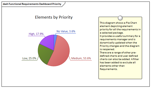
The Dashboard diagrams allow high quality charts and graphs to be created to display repository information in a visually compelling way, such as the ratio of Requirement Priorities in a pie chart. There is a toolbox page of pre-configured charts and graphs, but the user is free to create and save any number of charts sourcing data from anywhere in the repository. The charts and graphs provide valuable summary information that assists in the management of requirements. High level reporting and project status can be easily tracked and documented using the numerous charts and report elements available that tightly link in with the model content and status.
|
|
Where to find Dashboard Diagrams |
Project Browser | Right-click on Package | Add Diagram : |
|
Usage of Dashboard Diagrams |
Dashboard diagrams present compelling views of information - such as the status of Requirements in a particular release of the system - that can be viewed inside the model or conveniently copied directly into management or project team presentations. They are useful for planning an iteration such as an Agile sprint to view how ready the Requirements are for the implementation team; for example to view what percentage of the Requirements have been approved and are of high priority. |
|
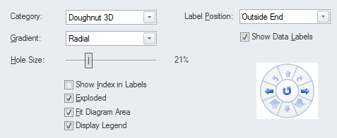
Options for Dashboard Diagrams |
The Standard Charts and Graphs available from the Toolbox can be configured in a number of ways, including changing the source, applying filters or modifying the appearance of the chart as indicated in this diagram, available from the chart's Properties window using the 'Appearance' section.
|
|
Learn more about Dashboard Diagrams |
|
 | Manage | Show All Perspectives | Extended | Dashboard