| Prev | Next |
Charts
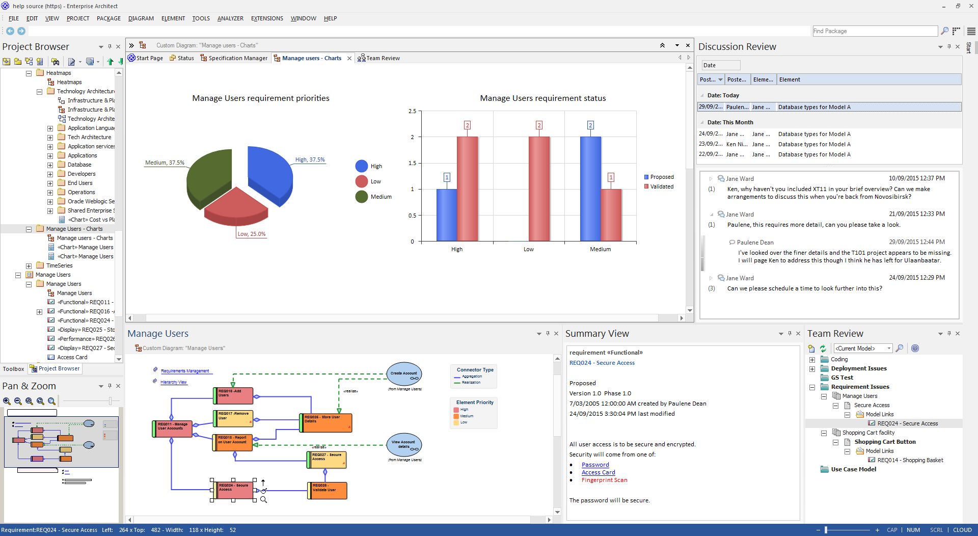
Enterprise Architect repositories typically contain a wealth of data that is crucial to business planning, organizational strategy, decision making and Project Management. One way of summarizing this data in a format suitable for swift and easy appraisal is to present it in the form of charts and graphs, which are ideal for including in reports and distributing via the Internet.
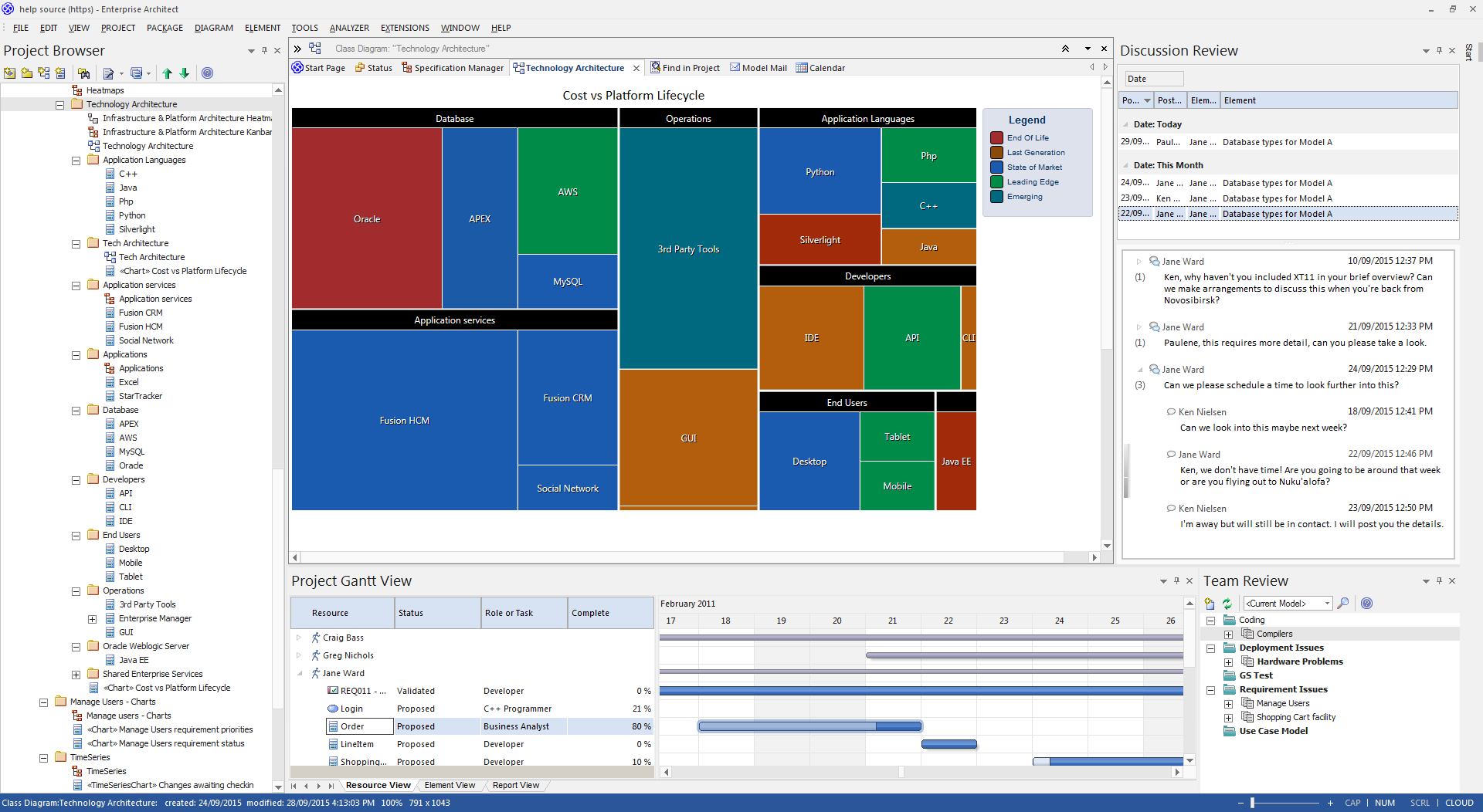
Expressive and elegant charts and graphs can be created within Enterprise Architect, and provide a convenient mechanism for presenting information such as requirements status, element priority and authorship, version and phase information, test case status and more. Charts are elements that can be placed onto any diagram, but they are commonly created on Dashboard diagrams, which are one of the extended diagram types. There are pre-set charts that can simply be dragged onto a diagram, and user defined charts where you can define the chart type, the content and the chart appearance.
This expressive and flexible feature provides an invaluable tool for the Project Manager and, apart from day-to-day tracking, provides useful collateral for inclusion into executive presentations.
Types of Chart Available
Using Enterprise Architect, you can create a number of different charts including:
- Pie - 2-dimensional and 3-dimensional
- Doughnut - 2D and 3D
- Torus
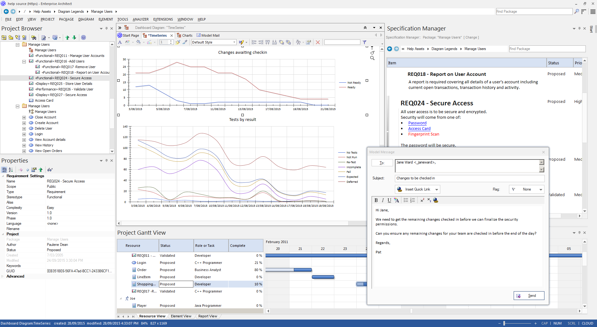
- Line Graph (Time Series)
- Table (Model Views)
- Horizontal bar - 2D and 3D
- Vertical column - 2D and 3D
- Heat Maps
You can also generate some of these charts filtered according to another data quantity, presenting this as table columns, segments of a bar or separate bars in a cluster.
|
Chart Examples
This collection of images shows the different chart types available. |
Creating a Chart
You create a Chart element by dragging a 'Chart' icon onto a diagram from the 'Dashboard' pages of the Diagram Toolbox. Standard Chart icons are also available on the common 'Artifacts' and 'Documentation' pages of the Toolbox. You then define the type of Chart, the data it presents, the source of that data and the appearance of the Chart, within the element properties.
Depending on the type of Chart you are creating, the data can be sourced from across the whole model, from specific Packages within the model, or from a custom SQL Query that extracts the information from the model. You can also paste the data from an external CSV file into the element, to be presented as a Chart.
Each Chart is dynamic, and is automatically updated whenever you edit it or open its parent diagram. You can also manually refresh it using an option on the element context menu. Time Series Charts can also be automatically updated by the Cloud Server according to a schedule that you define in the element properties.
Key Features
A major benefit of generating a Chart as and from a model element is that many of the facilities for working with elements - and the Packages and diagrams that contain them - are available on the Chart, such as:
Learn more

