| Prev | Next |
Time Series Chart
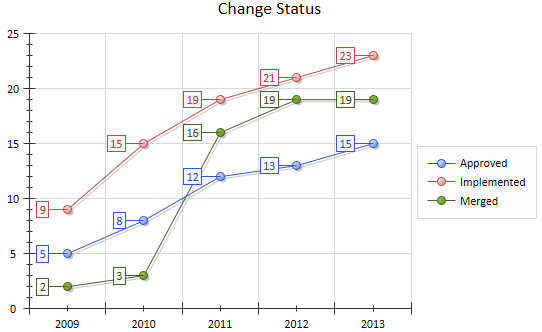
A Time Series Chart can have this appearance:
You define this appearance - or its alternatives - on the 'Appearance' page of the element 'Properties' dialog, after having set the data source, content and refresh interval on the 'Source' page. Each change in appearance setting is immediately illustrated by an example Chart on the 'Appearance' page.
Access
Select a Chart element on a diagram or in the Project Browser.
|
Ribbon |
Design > Element > Properties > Properties Dialog > Appearance |
|
Keyboard Shortcuts |
| Appearance |
|
Other |
Double-click on element | Appearance |
Define Time Series Chart Appearance
Option |
Action |
See also |
|---|---|---|
|
Type |
Click on the drop down arrow and select how the object Type is represented:
|
|
|
Show Data Markers |
Defaults to selected, to show a marker symbol to highlight the data point. Deselect the checkbox to hide the data markers. |
|
|
Marker Shape |
Disabled if the 'Show Data Markers' checkbox is not selected. Click on the drop-down arrow and select a shape for the data markers. The options are:
|
|
|
Marker Size |
Disabled if the Show Data Markers checkbox is not selected. Click on the drop-down arrow and select the size of the data markers, in pixels. Options are:
|
|
|
Show Data Labels |
This checkbox defaults to selected, to display each data value as a framed label (as shown above). Deselect the checkbox to hide the labels, if you want to observe the trend rather than the actual values. |
|
|
Label Angle |
Disabled if the Show Data Labels checkbox is not selected. Click on the drop down arrow and select the angle at which to display the data labels on the data points. Options are:
If there is any overlap of labels the position of those labels adjusts to ensure a clear display. |
|
|
Display Shadow |
This checkbox defaults to selected, to display the line and markers with a gray shadow (as shown above). Deselect the checkbox to omit the shadow. |
|
|
Line width |
Click on the down-arrow to change the width of the line on the Chart. The options are:
|
|
|
Line Style |
Click on the down arrow and select the format of the line. Options are
|
|
|
OK |
Click on this button to apply the changes and close the dialog. |
|
|
Cancel |
Click on this button to abort the changes and close the dialog. |
 )
) )
) )
) )
) )
)Learn more