| Prev | Next |
Pie Chart
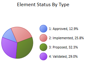
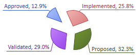
A Pie Chart can have this appearance:
You define this appearance - or its alternatives - on the 'Appearance' page of the element 'Properties' dialog, after having set the 'Type' field on the 'Source' page to Pie. Each change in setting is immediately illustrated by an example Chart on the 'Appearance' page.
Access
Select a Chart element on a diagram or in the Project Browser.
|
Ribbon |
Design > Element > Properties > Properties Dialog > Appearance |
|
Keyboard Shortcuts |
| Appearance |
|
Other |
Double-click on element | Appearance |
Define Pie Chart Appearance
Field |
Action |
See also |
|---|---|---|
|
Category |
Click on the drop down arrow and select the Pie Chart category:
|
|
|
Label Position |
You can show the meaning and value of each segment of the Chart as a label (see Show Data Labels); if you want to do this, you can specify where on the Chart the label will display. Click on the drop down arrow and select the position in which to display the labels relative to the segments:
|
|
|
Show Data Labels |
Select the checkbox to display a label against each segment of the Pie Chart.
|
|
|
Gradient |
Click on the drop down arrow and select the direction of the color gradient across the Chart:
The Torus 3D category of Chart relies on a specific color gradient to create the effect of the Torus, therefore changes in the Gradient settings have no effect on Charts of this type. |
|
|
Hole Size |
This field is available for the Doughnut and Doughnut 3D categories of the Pie Chart. Click on the slider and drag it to expand or contract the size of the hole in the middle of the Chart. The default (and the fixed size of the Torus 3D category) is 50%. If you drag the hole size to 0%, the Chart is effectively a Pie Chart or 3D Chart. |
|
|
Show Index in Labels |
If you are displaying the meaning and value of each segment, you can display a legend providing this information (see Display Legend) and have a simple index to the legend as a label against each segment. Select the checkbox to display the index (1, 2, 3...) as the label text Clear the checkbox to display more complete information in the label. |
|
|
Exploded |
Select the checkbox to pull each segment of the Chart out away from the other segments, with the 'first ' segment separated out even further.
|
|
|
Fit Diagram Area |
As you re-size your Chart element, the Chart width and height normally change with the element but stay in proportion. Leave this checkbox unselected to maintain this behavior. Select this checkbox to expand the Chart to fit the element space, even if the Chart has to elongate disproportionately up and down or sideways. |
|
|
Display Legend |
You can select to show the meaning and value of the Chart segments on the Chart itself, as labels, or you can display some or all of this information as a legend to the right of the diagram. Select this checkbox to display a legend for the Chart. Deselect the checkbox to hide the legend. |
|
|
Position Dial |
For the 3D Chart and Doughnut 3D categories:
For all categories of Pie Chart:
|
|
|
OK |
Click on this button to apply the changes and close the dialog. |
|
|
Cancel |
Click on this button to abort the changes and close the dialog. |

Learn more