| Prev | Next |
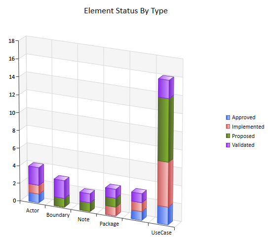
3D Bar Chart
A 3-dimensional Bar Chart can have this appearance:
You define this appearance - or its alternatives - on the 'Appearance' page of the element 'Properties' dialog, after having set the 'Type' field on the 'Source' page to '3D Bar'. Each change in setting is immediately illustrated by an example Chart on the 'Appearance' page.
Access
Select a Chart element on a diagram or in the Project Browser
|
Ribbon |
Design > Element > Properties > Properties Dialog > Appearance |
|
Keyboard Shortcuts |
| Appearance |
|
Other |
Double-click on element | Appearance |
Define 3D Bar Chart Appearance
Field |
Action |
See also |
|---|---|---|
|
Category |
Click on the drop down arrow and select the Bar Chart category:
|
|
|
Gradient |
Click on the drop down arrow and select the direction of the color gradient in each bar:
|
|
|
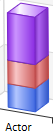
Type |
Click on the drop down arrow and select how the object Type is represented:
This option is grayed out if the 'Group By properties' field on the 'Chart Details | Details' page has no value. The Chart then displays as a simple column or horizontal bar for each object. |
|
|
Transparency |
Click on the slider and drag it across until the illustration shows the degree of transparency you require. The left extreme (no transparency) sets the bars to full fill color (as shown above); the right extreme (full transparency) sets the bars to colored edges and no fill.
|
|
|
Label Position |
Click on the drop down arrow and select the position in which to display the default data labels relative to the column, bar or segment:
The first option is illustrated in the Show Data Labels description; the other three options are illustrated in this composite picture:
|
|
|
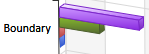
Show Data Labels |
This checkbox defaults to selected, to display the column or segment values as a framed label:
Deselect the checkbox to hide the labels. |
|
|
Display Legend |
Select this checkbox to show the meaning of the Chart bars, columns or segments as a legend to the right of the diagram. Deselect the checkbox to hide the legend. |
|
|
Fill Walls and Floor |
Select this checkbox to add darker shading to the end and back walls of the Chart, to provide contrast. Clear the checkbox to leave the walls pale. |
|
|
Thick Walls |
If the 'Fill Walls and Floor' checkbox is selected, this checkbox is enabled. Leave the checkbox unselected to leave the walls and floor as open, 2-dimensional lines (as illustrated above). Select this checkbox to show the walls and floor of the Chart as closed, 3-dimensional blocks.
|
|
|
Position Dial |
Click on the arrows on this dial to alter the perspective of the reader in viewing the Chart.
|
|
|
OK |
Click on this button to apply the changes and close the dialog. |
|
|
Cancel |
Click on this button to abort the changes and close the dialog. |


Learn more