| Prev | Next |
BPSim Charts
The Artifacts page of the Diagram Toolbox provides two icons specifically to generate charts that reflect selected results from BPSim simulations. These are:
- BPSim Result Chart - to generate a Chart that reflects selected results from a series of standard BPSim simulations
- BPSim Custom Result Chart - to generate a Chart that reflects results from a series of customized BPSim simulations
As for other Chart Artifacts, both BPSim Chart types can be quickly configured to display the simulation results in variations of a line chart, two-dimensional bar chart or 3-dimensional bar chart.
Prerequisites
To populate the Charts created from the Business Process Simulation Artifacts, you select the Result Artifacts created during the simulation of each configuration that you want to show. Therefore, the initial simulations must be performed first, and the Report Artifacts generated.
Access
Display the 'Artifacts' page of the Diagram Toolbox using any of the methods outlined in the table.
Then, drag the BPSim <type> Chart Artifact icon onto the diagram - a new chart element is created.
Double-click on the new chart element to open the 'Properties' dialog, showing the 'BPSim Chart' page.
|
Ribbon |
Design > Diagram > Toolbox > Artifacts |
|
Keyboard Shortcuts |
| Aritfacts |
|
Other |
You can display or hide the Diagram Toolbox by clicking on the |
Select Results to Display In Chart
Complete the fields on the 'BPSim Chart' page of the Chart 'Properties' dialog.
Option |
Action |
See also |
|---|---|---|
|
Base Report |
Click on the |
|
|
Type |
Click on the drop-down arrow and select the format type of the Chart in which to display the results - 2D Bar, 3D Bar or Line. After you have specified the report parameters to compare, you can select the 'Appearances' page of the dialog and define the appearance of the bar chart or Time line graph. |
3D Bar Chart Time Series Chart 2D Bar Chart |
|
Report Schema |
Expand the hierarchy as necessary and select the checkbox against each property to display on the chart. Each property will be represented by a separate line or group of bars on the chart. Usually you would select similar objects (such as different resources) and the same single property for each object (such as the degree of utilization of the resource). You have a wealth of properties to examine and compare, but any more than a couple on the same chart makes the chart hard to read. |
|
|
Experiments (BPSim Reports) |
This panel lists the simulation report results (as BPSim Result Artifacts) that you have selected to compare using the chart, in the sequence in which their selected parameter will be shown on the Chart. Usually, the Base Report remains as first in the list and the result for its parameter is shown at the left of the Chart. If you want to change the sequence, click on the Result Artifact name and click on the appropriate . To add further Result Artifact names to the list, click on the and browse for and select the Artifact from the 'Select <<BPSimReport>> Artifact' dialog. |
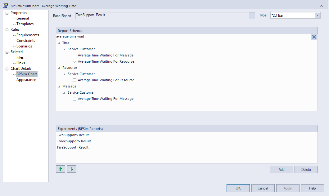
A BPSim Chart Example
In the Help Desk Phone Support example, we created three BPSim artifacts to do what-if analysis of: 'How many supports do we need to answer the customer's questions over the phones in an economical way?'
We started with two supports, then tried three and five supports. After simulation, we have a BPSim Report based on different configurations: TwoSupport-Result, ThreeSupport-Result, FiveSupport-Result.
These are the steps to create a chart to compare the customer's average time waiting for support:
- Create a BPSim Result Chart on the diagram, and name it Average Waiting Time.
- Double-click on the chart to open the Properties window, then open the 'BPSim Chart' tab.
- Click on the
 button to select a Base Report, from which we define the schema (legends) to use in the chart. Select 'TwoSupport-Result'.
 - Choose this schema:
- Time | Service Customer | Average Time Waiting For Resource - Click on the to add another two BPSim Reports: 'ThreeSupport-Result' and 'FiveSupport-Result'.
- Click on the , and adjust the size of the chart element. This chart gives us direct information.

These are the steps to create a chart to compare the degree of use of Support:
- Create a BPSim Result Chart on the diagram, and name it Utilisation Rate.
- Double-click on the chart to open the Properties window, then open the 'BPSim Chart' tab.
- Click on the button and select a Base Report, from which to define the schema (legends) to use in the chart. Select 'TwoSupport-Result'.
- Choose this schema:
- Resource | Support | Degree Of Utilisation - Click on the Add button to add another two BPSim Reports: 'ThreeSupport-Result' and 'FiveSupport-Result'.
- Click on the OK button and adjust the size of the chart element. This chart provides specific information.

Learn more