| Prev | Next |
Heat Maps
In addition to the more familiar Bar charts, Column charts and Pie charts, Enterprise Architect supports a grid-based layout called a Heat Map, which uses the color, size and grouping of cells to represent specific aspects of a data set.
Heat Maps are typically used to illustrate co-dependant properties that could influence strategic or project level decisions. For example, a Heat Map might group Requirements by Requirement Type into a matrix of categories, then further divide each category by Requirement Status, using the number of requirements of each status as the determinant of cell size. As an additional visual clue, the color for each cell can use yet another variable from the data set; for example, a cost number based on the sum of expected costs associated with each Requirement. In common with other types of chart, you can construct the data set using either the dialog fields or custom SQL that you have created or copied.
This example of a Heat Map indicates the relative costs of various elements of a software platform, at the same time showing (by cell color) what stage in a product lifecycle each component has reached.
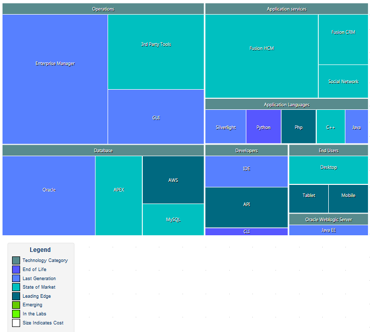
The use of Heat Maps depends to some extent on having good data that can be used to visually cue different aspects of the current model. For example, if you decide to use a cost analysis as part of a Heat Map, it is necessary to represent the cost using a field or Tagged Value. This should form part of the background modeling work that will feed the data sets driving well formed and useful Heat Maps.
Access
Select a Chart element on a diagram or in the Project Browser, then use any of the methods outlined here to open the chart element's 'Properties' dialog.
On the chart element's 'Properties' dialog, display the 'Source' tab, then the 'Package' child tab.
|
Ribbon |
Design > Element > Properties > Properties Dialog > Source > Package |
|
Context Menu |
Right-click on element |Properties | Source| Package |
|
Keyboard Shortcuts |
| Source | Package |
|
Other |
Double-click on element | Source| Package |
Configure a Heat Map
Having accessed the 'Properties' dialog pages for your Chart, you can start to configure your Heat Map.
Option |
Action |
See also |
|---|---|---|
|
Type |
Click on the drop-down arrow and select 'Heat Map' as the chart type. |
|
|
Size By |
Click on the For example, if you select Element.Author each cell will represent an Author name, and the cell size indicates the number of elements in the data set with that author name. |
|
|
Group By |
(Optional) Click on the For example, if you size by Defect.Status and group by Element.Author, each group will represent an Element Author and each cell within the group will represent the number of elements with that Author name having each of the defect statuses. |
|
|
Color By |
(Optional) Click on the |
Heat Map Appearance |
|
Chart Source |
Define which model and, if appropriate, which Package(s) to search for the data to represent in this Heat Map, as explained in the Source Package Help topic. |
From a Package |
 button and select the object type and property that the
 Customizing Results for the Heat Map
As an alternative to specifying the parameters of the Heat Map in the fields on the 'Package' tab, you can select the 'Custom SQL' tab and create a customized Heat Map using SQL. You still specify the chart type in the 'Type' field, but the other dialog fields are grayed out.
On the 'Custom SQL' tab, your SQL statement should contain these four column aliases (as demonstrated in the Example Custom Queries):
- Series - Represents the Heat Map cell and the label
- GroupName - Provides grouping for Heat Map cells; this alias can be excluded if no grouping is required
- ChartValue - Defines the size of a Heat Map cell according to the numerical value of a property (a value of, say, 12 units) rather than as a simple instance of the property (a value of 1 unit)
- Color - Returns a value that determines the color of the cell, by reference to the Color Set value types defined in the Heat Map appearance
Example Custom Queries
Example |
Description |
|---|---|
|
Example 1 |
In this query, each cell will represent an Author and will be sized relative to the number of Component elements the Author has created. Select t_object.Author AS Series, count(*) AS ChartValue FROM t_object WHERE t_object.Object_Type = 'Component' Group By t_Object.Author |
|
Example 2 |
In this query, each cell and its relative size will represent a Defect status. Each cell will be grouped by author and colored on priority type. This query would be accompanied by a Color Set definition of Value Type 'String' with the values 'High', 'Medium' and 'Low' and their respective colors. Select t_objectproblems.Status AS Series, t_object.Author AS GroupName, t_objectproblems.Priority AS Color, count(*) AS ChartValue FROM t_object, t_objectproblems WHERE t_object.Object_ID = t_objectproblems.Object_ID AND (t_objectproblems.ProblemType='Defect') group by t_objectproblems.Priority, t_object.Author, t_objectproblems.Status order by 1,2,3 |
Learn more