| Prev | Next |
Element Icons
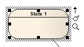
When you select an element on a diagram, or add a new element, a number of small icons display off the right hand side of the element underneath the Quick Linker arrow; for example:
 and
and

These icons display small versions of the diagram toolbars or perform specific actions, to help you quickly edit the element you have highlighted. If you do not want to show or use these icons, you can prevent their display by deselecting the 'Show buttons for selected Object on diagram' checkbox on the 'Objects' page of the 'Preferences' dialog.
Also, if an element shown in the diagram is locked, and the 'Display Element Lock Status' option is selected in the 'Diagram Properties' dialog, a locking indicator is displayed outside the top left hand corner of the element. The indicator is the same as the exclamation mark (!) against a locked element in the Project Browser:
- Red if the element is under a full lock or locked by another user
- Blue if the element is under a lock set by yourself or by a user in the same User Group as yourself
Icon Use
Icon |
Action |
See also |
|---|---|---|

|
Click on this icon to rotate a Fork/Join element from vertical to horizontal or vice-versa. |
Fork/Join |

|
Click on this icon to display a short formatting toolbar, to change the appearance of the element. The options are the same as those on the 'Layout > Style' ribbon panel. |
Style Panel |

|
Click on this icon to display the Current Element toolbar, to edit the element's properties and features. |
Current Element Toolbar |

|
When multiple elements are selected, click on this icon to display the Diagram Toolbar to change or align the elements together. |
Diagram Toolbar |

|
Click on this icon to toggle an Activity Partition between vertical and horizontal. |
Activity Partition |

|
Indicates that the Interaction Fragment currently contains messages; in this state you can:
This is the default condition when you open or reload a diagram containing a fragment. You can click on the icon to toggle to 'move freely' mode. |
Combined Fragment |

|
Indicates that the Interaction Fragment can be moved independently of the Messages or other elements contained within the fragment. This is the default condition when you first create the fragment. You can click on the icon to toggle to 'contains messages' mode (earlier). |
|

|
For elements that do not have the default rectangle/compartment rendition, such as Use Cases and Actors, toggles display of the element between their default shape and rectangular notation. |
Rectangle Notation |
Learn more