Prev Next

Windows Phone Wireframe Toolbox

The 'Windows Phone' Diagram Toolbox pages provide the templates for modeling the physical appearance of a Windows 8.1 Phone at a given state of execution of an application.

Access

On the Diagram Toolbox, click on to display the 'Find Toolbox Item' dialog and specify 'Wireframing' or 'Windows Phone'.

Ribbon

Design > Diagram > Toolbox

Keyboard Shortcuts

Alt+5

Windows Screen Types

Item

Description

Windows Phone

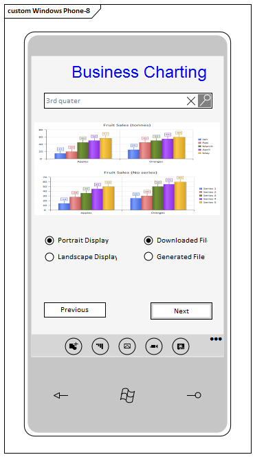
Generates a frame with a screen area for the Windows 8 Phone device. A prompt displays in which you specify portrait or landscape orientation.

Elements created within the screen area cannot be resized or moved to sit outside the borders of the screen. Elements created outside the frame can be dragged onto and off the frame, and can be as large as the view or element properties permit.

Text

Item

Description

Text Block

Generates an element that represents dominant text such as headings and labels. The element name is the displayed text.

Double-click on the element to open the 'Properties' dialog at the 'Wireframe' page. This displays a default set of six levels of heading styles. Click on a style name to populate the 'Properties' panel on the right of the dialog, and click on the down-arrow for each property and select the appropriate settings for the style. If you prefer, you can also change the name of the style in the 'Name' property.

If necessary, you can add further styles to the list. Click on the style group name and on the Add button. In the 'Enter name for item' prompt, type a name for the style and click on the OK button. The new style is added to the end of the list; if you want to move it further up the list, click on it and on the icon. Again, you define the style using the 'Properties' panel.

If you want to remove styles from the list, click on the style name and on the Remove button.

When you have set the styles that can be used for this text, click on the 'General' page of the Properties dialog and, in the 'Header Type' Tagged Value, click on the drop-down arrow and select the style to apply to the text of this specific Text Box.

Text Box

Generates a simple text field with a border, into which you can type any text you require. The element name is the displayed text, and does not wrap.

Controls

Item

Description

Button

Generates a rectangular icon representing a screen button, with the element name as the button text.

Tagged Values:

  • State: click on the drop-down arrow and select the button state to represent:
         -  Normal - the unselected button
         -  Focused - the button when the cursor is passed over it
         -  Selected - the button when it is clicked on
         -  Disabled - the button grayed out, when it is not available

Checkbox

Generates an element representing a labeled checkbox, the element name being the label.

Tagged Values:

  • Enabled: click on the drop-down arrow and select True to show the checkbox enabled for selection, or False to show the checkbox disabled and unavailable
  • State: click on the drop-down arrow and select 'Unchecked' to show the checkbox empty and unselected, or 'Checked' to show the checkbox selected with a tick inside it

Hyperlink Button

Generates a text element with the element name as the underlined text displayed, representing a hyperlink on the screen.

Double-click on the element to open the 'Properties' dialog at the 'Wireframe' page, which lists the three hyperlink states of normal 'Link', 'Visited' and 'Hover'. Click on a state name to populate the 'Properties' panel on the right of the dialog, and click on the down-arrow for each property and select the appropriate settings for the style to apply to that state. If you prefer, you can also change the name of the state in the 'Name' property.

If necessary, you can add further states to the list. Click on the state group name and on the Add button. In the 'Enter name for item' prompt, type a name for the state and click on the OK button. The new state is added to the end of the list; if you want to move it further up the list, click on it and on the icon. Again, you define the style using the 'Properties' panel.

If you want to remove states from the list, click on the state name and on the Remove button.

When you have set the states that the hyperlink can have, click on the 'General' page of the 'Properties' dialog and, in the 'State' Tagged Value, click on the drop-down arrow and select the state in which this hyperlink is to be depicted.

Image

Generates a rectangular object containing an 'X', to indicate the location of an image on the screen. There are no properties to set.

Radio Button

Generates an element representing a labeled radio button, the element name being the label.

Tagged Values:

  • Enabled: click on the drop-down arrow and select True to show the radio button enabled for selection, or False to show the radio button disabled and unavailable
  • State: click on the drop-down arrow and select 'Unselected' to show the radio button empty, or 'Selected' to show the radio button with a filled circle inside it

Tiles

Tile elements add to the phone screen a panel that, depending on type, shows an image and/or some text. The panel cannot be resized, and if it displays text the text occupies the top half of the element only. The amount of text displayed is influenced by the tile type, so you will need to experiment with the required type to see how much meaningful text you can display.

Item

Description

Collection Tile

Adds a tile with a random pattern, to represent a Windows Collection Tile.

Tagged Values:

  • Header: type a suitable text string as the tile heading; the text is displayed when 'Show Back' is set to True and if the 'Tile Type' supports it
  • Show Back: click on the drop-down arrow and select True to display the back of the tile instead of the front; for some tile types the back does not display regardless of this setting
  • Text: a <memo> Tagged Value in which you type the text to display on the back of the tile; the format and font of the displayed text depends on the 'Tile Type'
  • Tile Type: click on the drop-down arrow and select the type of the collection tile; this will only affect the display of the back of the tile, the front will always remain the same (see the Windows Tile Template Type Descriptions web page for more information on tile types)

Image Tile

Adds a tile that initially displays as a box with an 'X' in the center, but is intended to show an image that you select.

Tagged Values:

  • Image: click on the icon and select the image to display for this tile, from the 'Image Manager' dialog
  • Text: type in the text that will be displayed in white at the bottom of the image, dependent on the 'Tile Type'
  • Tile Type: click on the drop-down arrow and select the type of Image tile to display; this will either be an image only, or an image with text (see the Windows Tile Template Type Descriptions web page for more information on tile types)

Peek Tile

Adds a tile similar to an Image Tile, except that it can display the back of the tile to show more information.

Tagged Values:

  • Header: type a suitable text string as the tile heading; the text is displayed when 'Show Back' is set to True and if the 'Tile Type' supports it
  • Image: click on the icon and select the image to display on the front of this tile, from the Image Manager window
  • Show Back: click on the drop-down arrow and select True to display the back of the tile instead of the front
  • Text: a <memo> Tagged Value in which you type the text to display on the back of the tile; the format and font of the displayed text depends on the 'Tile Type'
  • Tile Type: click on the drop-down arrow and select the type of Peek tile to display (see the Windows Tile Template Type Descriptions web page for more information on tile types)

Text Tile

Adds a tile that displays text only. Depending on tile type, you can show a text string in the top half of the panel and two text items in the bottom right corner of the panel.

Tagged Values:

  • Block Text: type in a two-part text string to display at the bottom right of the tile, comprising a longer string that will be displayed in a small font, followed by a shorter string that will be displayed in a large font, the two strings separated by a semicolon; the short string will only display two characters in a square tile, or up to 5 characters in a wide tile, whilst the longer string can contain many more characters, for example: Messages;16
  • Text: type in some additional text to display at the top of the tile (dependent on tile type) such as a description or definition of the object identified in the lower text
  • Tile Type: click on the drop-down arrow and select the type of Text tile to display (see the Windows Tile Template Type Descriptions web page for more information on tile types)

Windows Phone Controls

Item

Description

App Bar

Generates an element that represents the 'Windows App Bar', which is displayed at the bottom of the phone screen to supply additional commands. This can include up to a maximum of five icons and six strings. When you drag the icon onto the diagram, you are prompted to select the orientation of 'Portrait' or 'Landscape' to match the screen orientation.

Double-click on the element to display the 'Properties' dialog at the 'Wireframe' page, displaying the element name at the top as the root node.

Click on the element name and, in the right-hand 'Properties' panel, click on the drop-down arrow in the value field for the 'Mode' property and select:

  • 'Mini' - to represent the App Bar as a thin bar with just the expand menu icon () in the top right, with no other icons or text
  • 'Default' - to represent the App Bar as a thin bar unless it contains items, in which case it will display just the icon in a circle, with no text or icon names
  • 'Expanded' - to show the App Bar containing each icon in a circle, the name of the item under the circle and up to six text strings representing additional menu options

You might prefer to set the App Bar properties after you have added some icons to it as child nodes. To add a child node, click on the root node and on the Add button, and type in the name of the icon or object. In the right-hand panel, set the properties of the child node:

  • 'Name': displays the name of the item, which you can edit if necessary; if the App Bar is rendered in 'Expanded' mode, the name of a symbol or font item will be displayed below the icon, whilst for a text item it will be displayed below and to the left of the icons in a vertical list
  • 'Type': click on the drop-down arrow and select from the list of item types; the type you select will determine what other property prompts are displayed:
         -  'SymbolIcon': displays the item as a symbol icon
         -  'FontIcon': displays the item as a glyph, using a font
         -  'BitmapIcon': draws a selected image as the icon
         -  'Text': (applies only in 'Expanded' mode) displays the item
             name as a member of a vertical list below and to the left
             of the icons; a maximum of six items can be listed at once
         -  'Separator': draws a vertical line between icons, which counts
             as one of the five available spots for icons on the App Bar;
             Separator items do not display names
  • 'Symbol': (displays if the 'Type' is set to 'SymbolIcon') click on the drop down arrow and select the symbol from the list
  • 'FontFamily': (displays if the 'Type' is set to 'FontIcon') type in the name of the font to draw with, such as 'Segoe UI Symbol'
  • 'Glyph': (displays if the 'Type' is set to 'FontIcon') type in the Hex value of the glyph to draw - for example, for the © symbol you can set 'FontFamily' to 'Arial' and type the Hex code '00A9'; font codes in Windows can be found via 'Control Panel | Fonts | Find a Character'
  • 'Bitmap': (displays if the 'Type' is set to 'BitmapIcon') click on the drop-down arrow and select a bitmap (as listed in the Image Manager)

Date Picker

Generates an element that depicts three blocks showing today's day and date, month and year, derived from the system date.

Tagged Values:

  • Date - if necessary, click on the drop-down arrow and select a different date from the calendar; if the displayed date is not today, you can reset it to today's date by clicking on the Today button
  • DateFormat - click on the drop-down arrow and select the date format to display:
         -  d/m/y
         -  m/d/y
         -  y/m/d

Password Box

Generates an element that represents a password field on the screen.

Tagged Values:

  • Password: a text string that represents a password
  • Password Character: a character that replaces each character of the 'Password' string when the password is hidden (when either 'Reveal Button' or 'Show Text' are set to False)
  • Reveal Button: if set to True (the default) draws a button that displays the 'Password' text string; if set to False the button is not displayed and the password string is represented by a string consisting of the 'Password Character'
  • Show Text: when 'Reveal Button' is set to True, setting 'Show Text' to True will display the 'Password' text string; otherwise a string displays composed of just the 'Password Character'

Progress Bar

Generates an element representing a 'process in progress' status bar, showing a number of 'dot' stages.

Progress Ring

Generates an element depicting the Windows 'processing in progress' circle of dots.

Search Bar

Generates an element representing a Windows search field, with the start search 'magnifying glass' icon at the end of it.

Tagged Values:

  • Placeholder Text - defaults to the word 'Search'; if necessary, overtype this with an alternative text string

Slider

Generates an element representing a slide control switch, with the slider 50% of the way across.

Tagged Values:

  • Fill amount - overtype the field with a value between 1 and 100, to set the percentage of the icon shown dark behind the slider

Time Picker

Generates an element that depicts two blocks showing the time in hours and minutes, in either 12-hour or 24-hour clock format.

Tagged Values:

  • 24 Hour Display - click on the drop-down arrow and select True to display the time in 24-hour format, or False (the default) to display the time in 12-hour format
  • Time - displays the time in three sections - hours, minutes and AM/PM; click on and overtype each section with the required value for the time

Toggle Switch

Generates an element depicting a slide-over toggle switch with the switch on the left, representing the 'off' state.

Tagged Values:

  • State - click on the drop-down arrow and select 'On' to represent the On state with the switch on the right of the icon, or 'Off' to move the switch back to the left of the icon to represent the Off state

Learn more