Prev Next

Apple iPhone/Tablet Wireframe Toolbox

The 'Apple Wireframing' Diagram Toolbox pages provide the templates for modeling the physical appearance of an Apple iPhone or tablet at a given state of execution of an application. They also provide a number of Patterns for generating model structures for different versions of the iPhone or iPad.

Access

On the Diagram Toolbox, click on to display the 'Find Toolbox Item' dialog and specify 'Wireframing' or 'Apple'.

Ribbon

Design > Diagram > Toolbox

Keyboard Shortcuts

Alt+5

Apple Screen Types

Item

Description

See also

iPad Air, iPad Mini, iPhone 4s, iPhone 5c, iPhone 5s, iPhone 6, iPhone 6 Plus

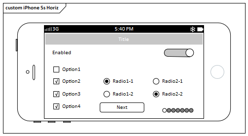
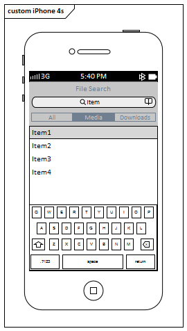
These icons each generate a frame for the device type you have selected. A prompt displays for you to specify portrait or landscape orientation. (The main illustration shows a landscape iPhone 5s frame and a portrait iPhone 4s frame.)

Tagged Values:

  • ShowStatusBar - click on the drop-down button and select to 'Show' or 'Hide' the status bar image on the element

Controls

Item

Description

See also

Check Box

Generates a labeled checkbox element, the label text being the name of the element.

Tagged Values:

  • State - click on the drop-down arrow and select the state to depict - 'Checked' (tick icon) or 'Unchecked' (box outline)

Radio Button

Generates a labeled radio button element, the label text being the name of the element.

Tagged Values:

  • State - click on the drop-down arrow and select the state to depict - 'Selected' (filled) or 'Unselected' (outline)

Combo Box

Generates an element representing a drop-down combo box.

Tagged Values:

  • DropDownState - click on the drop-down arrow and select 'Open' to depict the combo box in use, displaying all values, or 'Closed' to depict the combo box with a single selected value
  • Items - click on the drop-down arrow and select the item to depict as currently selected in the combo box and, if the list of items is expanded, highlighted in the list
    You can change the text of the items, and add or remove items in the list, by editing the 'Values:' list in the Tagged Value notes
Assign Notes to a Tagged Value

Label

Generates a Label text element. The name of the element is the text of the label.

Tagged Values:

  • Align Text - sets the alignment of the text to either left, centered or right
  • Multiline - sets the label to display text over multiple lines

List

Generates a List box element.

Tagged Values:

  • Items - click on the drop-down arrow and select the item to show highlighted in the list
    You can add, remove and rename items by editing the 'Values:' list in the Tagged Values Notes
  • ListType - click on the drop-down arrow and select to display the list as 'Simple', 'Numbered' or 'Bulleted'

Table

Generates a Table element with labeled columns, rows and cells.

Double-click on the table to bring up the element 'Properties' dialog at the 'Wireframe' page, which provides the facilities for editing the table (adding, renaming and deleting columns and rows, changing the column width and editing the cell text) You can either edit the text by clicking on it, or by right-clicking and selecting an option. Note that the editor does not provide a true image of the table's appearance on the screen.

Tagged Values:

  • Draw Lines - hides (or shows) the lines on all cells under the column headings so the table  resembles a List element instead
  • Highlight Headers - highlights the header of each column so that it is easily distinguishable
  • Properties - displays the HTML of the table

Image

Generates a place holder to indicate where an image will be placed on the dialog.

You can display an actual image by assigning an alternative image to the element.

Using the Image Manager

Apple Controls

Item

Description

See also

Address Bar

Generates a URL Address Bar element.

Tagged Values:

  • Address - defines the text displayed in the address bar

App Icon

Generates an App Icon element.

Tagged Values:

  • Image - specifies the name of an image held in the Image Manager, which is displayed as the appearance of the App icon (simply type in the name of the image as listed in the 'Name' column of the Image Manager)
  • Notification count - indicates the number of notifications this app has waiting; the number is displayed in the circle in the top right corner of the element
Using the Image Manager

Button

Generates a labeled Button element. The label text is the name of the element.

Tagged Values:

  • Button Style - sets the element shape:
         -  'Normal' draws a rectangle with rounded edges
         -  'Previous' draws a pennant shape pointing to the left
         -  'Next' draws a pennant shape pointing to the right
  • Text Alignment - defines the alignment of the button text within the element; left aligned, centered or right aligned

Date/Time Picker

Generates a Date and Time display element.

Tagged Values:

  • Date - sets the date that the element displays; if no date is specified this will be the current system date
  • Expanded - if True, draws the element as a section of calendar with the current date and/or time selected (as defined by the 'Type' Tagged Value); if False, draws the element as a simple text string showing the date and/or time
  • Time - sets the time displayed on the element; overtype the hour, minute and AM/PM segments as necessary
    If no time is specified it will display the current system time (non-specified time is displayed as 12:00 AM)
  • Type - draws the element showing the Date, the Time or both Date & Time

Group List

Generates a grouped list element with two levels of entry.

Double-click on the element to open the 'Properties' dialog at the 'Wireframe' page. Use this page to compose the list entries.

Click on the root node (the element name).

  • Show Groups - click on the drop-down arrow and select True to show the first-level list items, or False to hide them; the second-level list items display in either case but must belong to a group item whether it is shown or not

Click on the Group node (the first-level list item) directly underneath the root node.

  • Name - type in the text for the first-level list item (the item group name)

Click on an item node (the second-level list item) directly under a Group node. Item nodes do not have any child nodes.

  • Name - type the name of the list item
  • Text - type any additional text to be displayed (by default) under the item name
  • Text near link - click on the drop-down arrow and select True to display the additional text opposite the item name, where you can also add a link, or False to keep the text underneath the item name
  • Image - select an image name from the drop-down list or simply type in the name as listed in the 'Name' column of the Image Manager, to display the image to the left of the item name
  • Is Link - click on the drop-down arrow and select True to indicate that the item links to another page or additional information by displaying a '>' character to the right of the item name; select False to hide the link character
  • Link Image - select an image name from the drop-down list or simply type in the name as listed in the 'Name' column of the Image Manager, to display the image (if 'Is Link' is True) as the link icon instead of the > character
  • Selected - click on the drop-down arrow and select True to highlight the item name as selected, or False to not highlight the item
Using the Image Manager

Keyboard

Generates an element that depicts a keyboard.

Tagged Values:

  • Type - switches the image between a text (QWERTY) keyboard and a numeric keyboard

Loading Icon

Generates an element that depicts the Apple loading icon.

Page Control

Generates an element rendered as a row of gray circles, indicating the number of pages available and which of those represents the currently-displayed page.

Tagged Values:

  • Current page - draws a white circle in the sequence of gray circles to indicate which represents the current page displayed
  • Pages - the number of circles to draw, indicating the number of pages this control moves through (resize the element manually to display all the specified number of circles)

Search Bar

Generates an element representing a search field.

Tagged Values:

  • DrawStyle - toggles the element's appearance between the default app search with a query spyglass and a web search on an Apple device
  • Placeholder - type in the text that will be displayed in the control, to prompt the user to enter the search term
  • Prompt - type the prompt text to display above the query field, such as a reminder of what to search for; for example, if the search is to look up movies/recorded videos on the device, you might type 'Search for Videos' ('DrawStyle' must be set to default)
  • Scope - click on the drop-down arrow and select which search location is highlighted in the Scope Bar ('DrawStyle' must be set to default and 'Show Scope Bar' must be set to True)
  • Show Bookmarks - when set to True will draw a small book symbol on the right side of the query field, to indicate that this search control will store previous searches and can use them again ('DrawStyle' must be set to default)
  • Show Cancel Button - displays a Cancel button to the right of the query field ('DrawStyle' must be set to default)
  • Show Scope Bar - displays a row of scope options for this search control, underneath the query field ('DrawStyle' must be set to default)
  • Show search results - displays a drop down arrow on the right side of the search area, to indicate that the query will display the search results (overrides the Bookmark icon if both are set to display) ('DrawStyle' must be set to default)
  • Text alignment - aligns the Placeholder text to the Left, Right or Center of the query field

Segment Control

Generates an element depicting a set of tabs (defaulted to three tabs).

Tagged Values:

  • Tabs - click on the drop-down arrow and select the number of the tab to highlight to indicate the current tab; open and edit the Tagged Value Notes to add, remove or rename tabs
Assign Notes to a Tagged Value

Spinner Control

Generates an element representing a spinner control with a list of items that can be selected from.

Tagged Values:

  • Check Selected Item - when set to True will draw a tick on the left hand side of the item defined as selected
  • Items - click on the drop-down arrow and select the item to indicate as selected; you can  open and edit the Tagged Value Notes to add, rename or remove items from the list
  • Rounded Edges - click on the drop-down arrow and select the side(s) that show rounded corners; you can use this property to dock multiple spinner controls next to each other to create more complex spinner control selections, such as a page displaying a selection for Country, State, City and Suburb - set:
         -  Both to set rounded corners on both sides, if the spinner
            control is on its own
         -  Left to set rounded corners on the left edge and sharp corners
            on the right edge, if this spinner is the first in a row of docked
            spinner controls
         -  Right to set rounded corners on the right edge and sharp corners
            on the left edge, if this spinner is the last in a row of docked
            spinner controls, or
         -  None to set sharp corners on both sides, if this spinner is
            docked between two others
  • Text alignment - click on the drop-down arrow and select where to align the item text - to the  left, right or center of the control
Assign Notes to a Tagged Value Element Context Menu Operations

Stepper

Generates an element depicting a decrement/increment (minus/plus) control.

Switch

Generates an element representing a sliding on/off switch.

Tagged Values:

  • DisplayText - toggles between displaying and hiding the two state text values
  • State - toggles between the 'on' state (gray background with white circle on the right and - if DisplayText is True - the 'on' text) and the 'off' state (white background with white circle on the left and - if DisplayText is True - the 'off' text)
    The state text values default to On and Off; you can edit the Tagged Value Notes to change these to any other pair of values (you can add more values but only the first two are applied)
Assign Notes to a Tagged Value

Text Field

Generates a text field in which the end user can type free text, such as the name for a login page. The field contains the text 'TextField' and a crossed circle.

Tagged Values:

  • Border Style - click on the drop-down arrow and select the border style for the element:
         -  Rounded Rect - a rectangle with rounded corners
         -  Bezel - a rectangle with bevelled top and left edges
         -  Line - a rectangle with sharp corners and single-line edges
         -  None - a rectangle with no borders
  • Text alignment - click on the drop-down arrow and set the text to align to the left, right or center of the control

Title

Generates an element that represents the title for a page, the element name being the title text (such as 'Settings'). The element is a rectangle with gray background and white text.

Toolbar

Generates an image that represents a Toolbar with default icons, which you can add to or replace with images from the Image Manager.

Double-click on the element to display the 'Properties' dialog at the 'Wireframe' page, which lists the icons displayed in the frame of the Toolbar element.

  • To add a new icon click on 'Toolbar' and on the Add button, and in response to the prompt type in the name of the icon, which adds the name to the bottom of the list; click on the name and in the 'Image' Property field type the name of the icon file, as displayed in the 'Loaded Image' panel of the Image Manager
    You can add a 'Separator' (displayed as |) to the list, to separate different groups of icons on the toolbar; simply type the name 'Separator' in the name prompt
    To position the icon on the toolbar, click on it in the list and click on the buttons
  • To remove an icon from the list, click on it and click on the Remove button; the icon is immediately removed from the list and, when you close the dialog, from the Toolbar
Using the Image Manager

Tab Bar

Generates an element that depicts a row of tabs represented by images.

Double-click on the element to display the 'Properties' dialog at the 'Wireframe' page, which shows the root node (the TabBar element itself) and the items contained in the TabBar (as images).

  • To add a new icon click on 'TabBar' and on the Add button, and in response to the prompt type in the name of the item, which adds the name to the bottom of the list
    To position the item on the TabBar, click on it in the list and click on the buttons
  • To remove an item from the list, click on it and click on the Remove button; the item is immediately removed from the list and, when you close the dialog, from the TabBar

Root node Properties:

  • Show Text - displays (True) or hides (False) the item names as text underneath the tab images
  • Background Color - click on the drop-down arrow and select the background color of the TabBar
  • Selected Font Color - click on the drop-down arrow and select the font color of the text if the item is selected
  • Non Selected Font Color - click on the drop-down arrow and select the font color of the text if the item is not selected

Item node Properties:

  • Name - the name of the item, which can be displayed underneath the image in the TabBar (see Show Text)
  • Image - the name of the image file to show if the item is not selected; the file name is as listed in the Image Manager
  • Selected Image - the name of the image file to show if the item is selected; the file name is as listed in the Image Manager

Select the 'General' page of this Tab Bar element's 'Properties' dialog, and click on the 'Tags' tab.

Element Tagged Value:

  • SelectedTab - Click on the drop-down arrow and select the name of the item to represent as selected
Using the Image Manager

Apple Patterns

You can use any of these Patterns as examples of how the elements are used, as basic components of a larger model, or as the starting point to develop a more detailed model of one or more of the products.

Item

Description

See also

Apple iPad Air

Creates an example model for the Apple iPad Air.

Apple iPad Mini

Creates an example model for the Apple iPad Mini.

Apple iPhone 4s

Creates an example model for the Apple iPhone 4s.

Apple iPhone 5c

Creates an example model for the Apple iPhone 5c.

Apple iPhone 5s

Creates an example model for the Apple iPhone 5s.

Apple iPhone 6

Creates an example model for the Apple iPhone 6.

Apple iPhone 6 Plus

Creates an example model for the Apple iPhone 6 Plus.

Learn more