| Prev | Next |
Dialog Wireframe Toolbox
The 'Dialog Wireframing' Diagram Toolbox pages provide the templates for modeling the physical design, appearance and operation of a screen dialog. You can see and build on an example of how to model the dialog interface by dragging the 'Dialog Pattern' icon onto a diagram.
Access
|
Ribbon |
Design > Diagram > Toolbox : |
|
Keyboard Shortcuts |
: |
|
Other |
You can display or hide the Diagram Toolbox by clicking on the |
 > Specify 'Wireframing - Dialog' in the 'Find Toolbox Item' dialog
 or
or  icons at the left-hand end of the Caption Bar at the top of the
 Screen Types
Item |
Description |
See also |
|---|---|---|
|
Dialog |
Generates an element that represents a dialog outline, with a title (the element name). This has several components that you can expose and define in the element 'Properties' dialog, some using the Tagged Values on the 'Wireframing' tab of the 'General' page, and some using the 'Wireframe' page of the dialog. Tagged Values:
Wireframe Page: Displayed by default when you double-click on the element. Use the options to modify the Status Bar at the bottom of the dialog. Click on the element name.
Click on 'Label' - this defines the first segment of the progress bar at the left hand end of the Status Bar.
Click on 'Progressbar' - this defines a second segment of the progress bar. The properties are the same as for the first segment (above) except that there is no default 'Text' and the 'Type' defaults to 'Filled'. If you want to add another segment to the progress bar, click on the element name, click on the and provide a name for this segment. Provide values for the 'Text' and 'Type' properties as above. If you want to remove segments from the progress bar, click on the segment name and click on the . If you remove all segments and the 'Zoom Bar' and 'Resize Handle', the status bar itself is removed. You can change the sequence of segments by clicking on a segment name and on the |
Using the Image Manager |
|
Client Area |
Generates a frame element that represents the client area of the device. Tagged Values:
|
 buttons.
Controls
Item |
Description |
See also |
|---|---|---|
|
Button |
Generates an element that represents a simple button with the element name as the button text. Tagged Values:
|
|
|
Check Box |
Generates a labeled checkbox element, the label text being the name of the element. Tagged Values:
|
|
|
Radio Button |
Generates a labeled radio button element, the label text being the name of the element. Tagged Values:
|
|
|
Combo Box |
Generates an element representing a drop-down combo box. Tagged Values:
|
Assign Notes to a Tagged Value |
|
Label |
Generates a Label text element, on which the label text is the name of the element. Tagged Values:
|
|
|
List |
Generates a List box element. Tagged Values:
|
|
|
Table |
Generates a Table element with labeled columns, rows and cells. Double-click on the table to display the element 'Properties' dialog at the 'Wireframe' page, which provides the facilities for editing the table (adding, renaming and deleting columns and rows, changing the column width and editing the cell text) through context menu options and buttons. Note that the editor does not provide a true image of the table's appearance on the screen. Tagged Values:
|
|
|
Image |
Generates a place holder to indicate where an image will be placed on the phone or tablet. You can display an actual image by assigning an alternative image to the element. |
Using the Image Manager |
Dialog Controls
Item |
Description |
See also |
|---|---|---|
|
Checkbox List |
Generates an element depicting a checklist where each item has a checkbox on the left hand side. Double-click on the table to display the element 'Properties' dialog at the 'Wireframe' page, which you use to maintain this element. For each 'Checkbox' item, complete these fields:
To add another item to the list, click on the element name and on the , then provide a name for the item. To remove an item from the list, click on the item and on the . You can change the sequence of items by clicking on an item name and on the |
|
|
Format Bar |
Generates a simple element representing a text formatting bar. If you want to represent a toolbar containing icons you have defined, use the 'Toolbar' icon. |
|
|
List View |
Generates an element representing a horizontal, rectangular or vertical list of text items (depending on the size of the element) with or without associated images above them. Double-click on the table to display the element 'Properties' dialog at the 'Wireframe' page, which you can use to add, remove or change the items and their icons. For each item, complete these fields:
To add another item to the list, click on the element name and on the , then provide a name for the item. To remove an item from the list, click on the item and on the . You can change the sequence of items by clicking on an item name and on the If you reduce the size of the element so that not all items can be shown, a scroll bar automatically displays on the right edge of the element:
|
Using the Image Manager |
|
Status Bar |
Generates a status bar element identical to the automatically-generated status bar on the 'Dialog' element (above), except that you can position this element independently of the dialog, as required. |
|
|
Toolbar |
Generates an element to represent a toolbar of icons, already set up with some standard toolbar icons. Double-click on the element to display the 'Wireframe' page of the 'Properties' dialog, which you can use to add, remove or change the items and their icons. For each item, complete these fields:
To add another item to the list, click on the element name and on the , then provide a name for the item. You can add one or more items called 'Separator' to the list, which display as a |, to partition groups of related icons in the toolbar. If you add an image to this item, the image is overridden by the |. To remove an item from the list, click on the item and on the . You can change the sequence of items by clicking on an item name and on the |
|
|
Audio Player |
Generates a simple element to indicate an audio player control. |
|
|
Calendar |
Generates an element representing a basic calendar, showing today's date derived from the system date. Tagged Values:
|
|
|
Header |
Generates an element representing a title or header text on a dialog. The text itself is the element name. The element can reflect one of a range of header levels, each with a different font style. You specify which level of header to display using the 'HeaderType' Tagged Value within the element. Double-click on the element to display the 'Wireframe' page of the 'Properties' dialog, which you can use to add, remove or change the header levels and styles. For each item, complete these fields:
To add another heading level to the list, click on the element name and on the , then provide a name for the level. To remove a level from the list, click on the item and on the . You can change the sequence of heading levels by clicking on a level name and on the Tagged Values:
|
|
|
Hyperlink |
Generates an element representing a hyperlink in one of three states: 'Link', 'Visited' and 'Hover' (mouse-over). The Hyperlink text is the element name. Double-click on the element to display the 'Wireframe' page of the 'Properties' dialog, which you can use to add, remove or change the hyperlink states. For each state, complete these fields:
To add another hyperlink state to the list, click on the element name and on the , then provide a name for the state. To remove a state from the list, click on the item and on the . You can change the sequence of states by clicking on a state name and on the Tagged Values:
|
|
|
Menu Bar |
Generates an element representing a standard menu bar at the top of the screen, initially with three options ('File', 'Edit' and 'View') with the 'File' option expanded into a sub-menu. Double-click on the element to display the 'Wireframe' page of the 'Properties' dialog, which you can use to add, remove or change the menu options in the top level, sub-menu and - if you prefer - further sub levels. For each menu option - at any level - complete these fields:
To add a menu sub-option at any level, click on the parent option name and on the , then provide a name for the sub-option. You can add one or more items called 'Separator' to the list, which displays as a horizontal line across the list, to partition groups of related options in the menu. To remove an option from the list, click on the item and on the . You can change the sequence of options by clicking on an option name and on the To move an option between two levels of menu, click on the option name and on the |
|
|
Paragraph |
Generates a text element with no border, but that can contain multi-line text with basic HTML formatting. Tagged Values:
|
|
|
Progress Bar |
Generates a status bar element representing the progress of a process. Tagged Values:
|
|
|
Rating Control |
Generates an element depicting a star-rating band. The element always shows five stars, and the number of filled stars indicates the rating. Tagged Values:
You can only re-size the element horizontally; the vertical dimension adjusts automatically to always depict five uniformly-shaped stars. |
|
|
Scrollbar - Horizontal |
Generates an element representing a horizontal scrollbar. |
|
|
Scrollbar - Vertical |
Generates an element representing a horizontal scrollbar. |
|
|
Tab Control |
Generates an element representing a series of tabs or pages. You can name the tabs and mark them as selected; however, child elements will not 'switch' when changing tabs (that is, setting a different tab as selected will still display the same child items in the tab space). Tagged Values:
If you reduce the size of the element so that all tabs cannot be shown, a scroll icon ( |
Assign Notes to a Tagged Value |
|
Text Field |
Generates a text element with a pale border, the text being the element name, representing a simple data entry field. |
|
|
Video Player |
Generates an element that represents a video player control. |
|
|
Date/Time Picker |
Generates an element that represents the Microsoft Date/Time Picker. Tagged Values:
|
|
|
Tree Control |
Generates an element representing a hierarchy or tree of nodes, with broken lines connecting sibling nodes and an expansion box (+ or -) next to nodes that have subnodes. Double-click on the element to display the element 'Properties' dialog at the 'Wireframe' page, which you can use to add, remove or change the tree nodes in the top level, sub-level and - if you prefer - further sub levels. For each node - at any level - complete these fields:
To add a sub-node at any level, click on the parent node name and on the , then provide a name for the sub-node. To remove a node from the hierarchy, click on the node name and on the . You can change the sequence of nodes by clicking on a node name and on the To move a node between two levels of the hierarchy, click on the node name and on the You can also directly edit the XML of the element on the 'Wireframe' tab of the Element Properties window. |
|
|
Groupbox |
Generates an element representing a Groupbox, with the name of the element in the top left corner. You can use this element to enclose and group other elements of the dialog. |

 buttons.
 button to edit the '
 ) automatically displays in the top right corner of the element.
Patterns
Item |
Description |
See also |
|---|---|---|
|
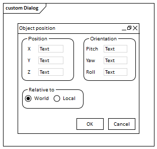
Dialog |
This Pattern generates a small dialog containing three panels with data entry fields and radio buttons, and two buttons, as depicted at the start of this topic. You can use this as an example, or as the basis for a similar dialog design. |
Learn more