| Prev | Next |
Android Wireframe Toolbox
The 'Android Wireframing' Diagram Toolbox pages provide the templates for modeling the physical appearance of an Android tablet or phone at a given state of execution of an application. They also provide Patterns for generating a standard model structure for each Android appliance.
Access
On the Diagram Toolbox, click on  to display the 'Find Toolbox Item' dialog and specify 'Wireframing' or 'Android'.
|
Ribbon |
Design > Diagram > Toolbox |
|
Keyboard Shortcuts |
|
Android Screen Types
Item |
Description |
See also |
|---|---|---|
|
Android Phone |
Generates a frame for the face of the Android Phone you are modeling. A prompt displays for you to specify portrait or landscape orientation. Child controls will be contained within the area of the screen. Tagged Values:
|
|
|
Android Tablet |
Generates a frame for the Android Tablet you are modeling. A prompt displays for you to specify portrait or landscape orientation. Child controls will be contained within the area of the screen. Tagged Values:
|
|
|
Client Area |
Generates a frame element that represents the client area of the device. Tagged Values:
|
Composite
Item |
Description |
See also |
|---|---|---|
|
Expandable List View |
Generates an element that represents a two-level grouped list that can be expanded to show one or both levels of item. Double-click on the element to display the 'Properties' dialog at the 'Wireframe' page, which shows the root node (the Expandable List element name), the group heading items (directly under the element name) and the group items (under the group headings).
Click on the Item Name (the first-level list item directly underneath the element name).
Click on a sub-item name (the second-level list item) directly under an Item name. Sub-item nodes do not have any child nodes.
|
|
|
Table |
Generates a Table element with labeled columns, rows and cells. Double-click on the table to bring up the element 'Properties' dialog at the 'Wireframe' page, which provides the facilities for editing the table (adding, renaming and deleting columns and rows, changing the column width and editing the cell text) through context menu options and buttons. Note that the editor does not provide a true image of the table's appearance on the screen.
|
|
|
Tab Host |
Generates a tab control element on the diagram. You can name the tabs and mark them as selected; however, child elements will not 'switch' when changing tabs (that is, setting a different tab as selected will still display the same child items in the tab space). Tagged Values:
If you reduce the size of the element so that all tabs cannot be shown, a scroll icon ( |
Assign Notes to a Tagged Value |
|
Simple List |
Generates a list box containing a list of items with no sub-items. Double-click on the element to display the 'Properties' dialog at the 'Wireframe' page. To:
|
|
|
2 Lane List |
Generates a list box as for a Simple List, but each item name is in bold and can have a description underneath the item name. Double-click on the element to display the 'Properties' dialog at the 'Wireframe' page.
Other options are the same as for the Simple List. |
|
|
Checklist |
Generates a list box as for a Simple List, but each item name has a tick outline to the right of it. For selected items, the outline is filled. Double-click on the element to display the 'Properties' dialog at the 'Wireframe' page.
Other options are the same as for the Simple List. |
|
|
Single Choice List |
Generates a list box as for a Simple List, but each item name has a radio button outline to the right of it. For a selected item, the outline is filled. Double-click on the element to display the 'Properties' dialog at the 'Wireframe' page.
Other options are the same as for the Simple List. |
 buttons
 ) automatically displays in the top right corner of the element.
Form Widgets
Item |
Description |
See also |
|---|---|---|
|
Switch |
Generates an element representing a simple Android switch. The switch can have two states (such as On and Off) and a label taken from the name of the element. Tagged Values:
|
Assign Notes to a Tagged Value |
|
Rating Control |
Generates an element depicting a star-rating band. The element always shows five stars, and the number of filled stars indicates the rating. Tagged Values:
You can only re-size the element horizontally; the vertical dimension adjusts automatically to always depict five uniformly-shaped stars. |
|
|
Toggle Button |
Generates an element depicting a single-celled switch with no label (the element name is not shown). You can edit the depicted state in the same way as for the Switch element (above). |
|
|
Progress Bar (Large) |
Generates an element representing the circular Android progress icon. |
|
|
Progress Bar (Horizontal) |
Generates an element representing the progress of a process, defaulted to 30% complete. Tagged Values:
|
|
|
Button |
Generates a simple labeled Button element, the label text being the name of the element. |
|
|
Radio Button |
Generates a labeled radio button element, the label text being the name of the element. Tagged Values:
|
|
|
Checkbox |
Generates a labeled checkbox element, the label text being the name of the element. Tagged Values:
|
|
|
Seek Bar |
Generates an element representing the progress in playing through an audio or video file. Tagged Values:
|
|
|
Keyboard |
Generates an element that depicts a keyboard for Android applications. Tagged Values:
|
|
|
Spinner |
Generates an element representing the Android version of a drop-down combo box. Tagged Values:
|
Assign Notes to a Tagged Value |
Text Fields
Item |
Description |
See also |
|---|---|---|
|
Plain Text |
Generates a text element with no border, the text being the element name. Tagged Values:
|
|
|
Multiline Text |
Generates a text element with no border, but that can contain multi-line text with basic HTML formatting. Tagged Values:
|
 button to edit the
 Image_Media
Item |
Description |
See also |
|---|---|---|
|
Image |
Generates a place holder to indicate where an image will be placed on the phone or tablet. You can display an actual image by assigning an alternative image to the element. |
Using the Image Manager |
|
Video Player |
Generates an element that represents a video player control on the phone or tablet. |
|
|
Audio Player |
Generates an element that represents an audio player control on the phone or tablet. |
Time_date
Item |
Description |
See also |
|---|---|---|
|
Calendar |
Generates an element depicting a calendar (the default image), showing the current month, day and year based on the system date. Tagged Values:
You cannot resize this element. |
|
|
Date Picker |
Generates an element that depicts a set of spinners showing today's date, derived from the system date. Tagged Values:
You cannot resize this element. |
|
|
Time Picker |
Generates an element that depicts a pair of spinners showing the current time, in hours and minutes, derived from the system clock. Tagged Values:
You cannot resize this element. |
|
|
Clock |
Generates an element that represents an analog clock face with hour and minute hands and no numerals, displaying the system time. You can change the rendition to a digital display. Tagged Values:
You can resize the element in 'Analog' format, but not in 'Digital' format. |
Android Patterns
Item |
Description |
See also |
|---|---|---|
|
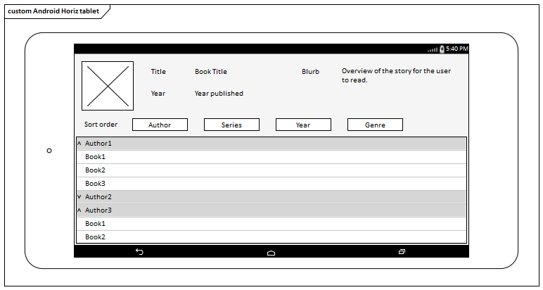
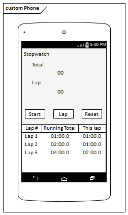
Android Phone / Android Tablet |
These Patterns create example models of the two Android product configurations. You can use them as your examples of how the elements are designed, as basic components of a larger model, or as the starting point to develop a more detailed model of one or more of the products. |
Learn more