| Prev | Next |
Roadmap Diagram Options
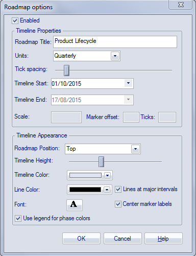
This topic describes each of the options available on the 'Roadmap options' dialog, which you use to define a Roadmap Timeline on a diagram. The process of creating a Roadmap diagram is described in the Roadmap Diagrams topic.
Roadmap Options
Option |
Description |
See also |
|---|---|---|
|
Enabled |
Select this checkbox to show the Roadmap Timeline and associated features on the diagram. Clear the checkbox to hide the Roadmap on the diagram (which will hide Roadmap features derived from a Legend, but not element features applied by a Legend independent of the Roadmap). |
|
|
Roadmap Title |
Type in an appropriate name or title for the Roadmap, or leave blank if no title is required. |
|
|
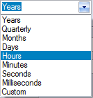
Units |
Click on the drop-down arrow and select the appropriate unit of time for the Timeline.
You can also select 'Custom' and define your own scale of measurement; see Setting up a Custom Scale at the end of this topic. The selected unit is automatically identified in the top left corner of the Timeline, and the appropriate sequence of units displays along the width of the Timeline. Each standard time unit is automatically divided into the appropriate number of smaller divisions by separators (or 'ticks'); each Quarter is divided into three months, each year has twelve divisions, each day has 24 divisions, and so-on. To see some of the finer divisions (such as seconds in a minute) you might have to set the 'Tick spacing' slider to the left hand end, which minimizes the width of the labeled units so that you can see more of them on the screen. |
|
|
Tick spacing |
Click on the slider and drag it left or right to decrease or increase the width of the scale divisions in the Timeline. If you change this setting after positioning elements on the diagram, those elements are shortened or lengthened automatically to maintain their relationship to the scale divisions. |
|
|
Timeline Start |
If the 'Units' field is set to 'Years', 'Quarterly', 'Months' or 'Days', this field defaults to today's date. To change this either click on the section of the date and overtype it, or click on the drop-down arrow and select another date from the calendar. For smaller units of time and for the 'Custom' setting, the field is blank and you can set a start value. If you do not set a start value, the first marker on the diagram defaults to 0. The start date or value is shown as the label of the first major section on the Timeline. |
|
|
Timeline End |
If the 'Units' field is set to 'Years', 'Quarterly', 'Months' or 'Days', this field is disabled and the Timeline is indefinite. For smaller units of time and for the 'Custom' setting, the field is blank and you can set an end value. If you do not define an end value, the unit count increments up to the marker containing the right edge of the rightmost element. When an end value is defined and that end is reached, the timeline loops back to the 'Timeline Start' value. This allows the single timeline to be extended using the diagram width instead of the height, documenting a different set of elements against the same timeline. |
|
|
Scale |
This field is enabled when you select 'Custom' in the 'Units' field. Type in the appropriate scale unit; the value is displayed in the top left corner of the Timeline as the Unit. See Setting up a Custom Scale at the end of this topic. |
|
|
Marker offset |
This field is enabled when you select 'Custom' in the 'Units' field. Type in the number of units that each major segment of the scale represents. See Setting up a Custom Scale at the end of this topic. |
|
|
Ticks |
This field is enabled when you select 'Custom' in the 'Units' field. Type in the number of 'ticks' to subdivide each major segment of the Timeline. See Setting up a Custom Scale at the end of this topic. |
|
|
Roadmap Position |
Click on the drop-down arrow and select whether to show the Timeline at the top of the Diagram View or the bottom, or in both places. ('Top & Bottom' is particularly useful if your diagram fills the screen height.) |
|
|
Timeline Height |
Click on the slider and drag it to the left or right to decrease or increase the depth of the Timeline ribbon. The optimum depth keeps all the Timeline text separate and distinct without hiding too much of the diagram itself. |
|
|
Timeline Color |
Click on the drop-down arrow and select from the standard palette the color in which to display the Timeline. The display alternates between a lighter and darker shade of the color to help distinguish between the individual segments. This shading is less clear with dark or vibrant colors. If you want to select a color other than those in the standard palette, click on the and select or define the required color. |
Standard Colors |
|
Line Color |
It is possible to display vertical guidelines to the diagram, issuing from the main segment boundaries (see the 'Lines at major intervals' option). Click on the drop-down arrow and select from the standard palette the color in which to display these lines. If you want to select a color other than those in the standard palette, click on the and select or define the required color. |
Standard Colors |
|
Font |
Click on the A icon to display the 'Font' dialog, and select the font type, style, size, color and effects to apply to the text of the Timeline. |
|
|
Lines at major intervals |
Select the checkbox to display vertical lines across the diagram, to mark the major segments of the Timeline. Deselect the checkbox to hide the lines. On the example diagram, the lines separate the quarters and are shown in black. |
|
|
Center marker labels |
Select this checkbox to display the segment labels in the center of the segment. Clear the checkbox to display the segment labels straddling the left edge of the segment. |
|
|
Use legend for phase colors |
Select this checkbox to apply the roadmap notation of a bar divided into colored segments representing phases to all elements. This requires a legend with 'Apply auto color' enabled to exist on the diagram. Each property color you define in the Legend is represented by a color band in each element in the Roadmap. When you have set up the Legend and the Roadmap, resize the elements to span the appropriate number of unit segments that they map to. Within each element, drag the left and/or right boundary of each color segment so that they also span the number of unit segments that they align to, as illustrated in the example Roadmap. |
Legend Key |
|
OK |
Click on this button to close the dialog and apply any changes you made to the settings. |
|
|
Cancel |
Click on this button to close the dialog and abort any changes you made to the settings. |
Setting up a Custom Scale
A custom scale gives you the ability to create a Roadmap diagram for a process that is not mapped against time, or to give a different scale to a unit of time. For example, you might want to show the consumption of raw materials in tons over several stages, or the progress of a step taking two minutes where the changes in flow are better mapped at 10 second intervals than at 1 second intervals.
To set up a custom scale on a Roadmap diagram, set the fields on the 'Roadmap Options' dialog as described in the previous Roadmap Options table, but provide specific values for the fields described in this table.
Field |
Action |
See also |
|---|---|---|
|
Units |
Click on the drop-down arrow and select 'Custom'. This setting enables the 'Scale', 'Marker offset' and 'Ticks' fields, and clears the 'Timeline Start' and 'Timeline End' fields for free-text input. |
|
|
Timeline End |
In the blank field, type the end, cut-off or target value for the scale. For example, a target revenue or a maximum cost, period or capacity. When an end value is defined and that end is reached, the timeline shows the 'Timeline Start' value again and increments from there. You can use this repeated scale to set up a different group of elements under the same timeline. If you do not define an end value, the unit count increments up to the marker containing the right edge of the rightmost element. |
|
|
Scale |
Type in the required unit of measurement, in numerals, text or both; you might specify, for example, units of distance, weight or monetary value, or a percentage. The value is displayed in the top left corner of the Timeline as the Unit. |
|
|
Timeline Start |
In the blank field, type the start value for the scale. For example, any wait period at the start of the process, or minimum balance or brought-forward balance for accounting scenarios. The Timeline then increments from that value. If you do not specify a value, the Timeline starts at 0. |
|
|
Marker offset |
Type in the number of units that each major segment of the scale represents. You set this value in combination with the 'Scale' field; you might, for example, set the scale to '$US 1000' and the offset to '1', or the scale to simply '$US' and the offset to '1000'. The offset can also represent the natural unit of progression, so if one output delivers two units you might set the offset to 2 and the scale reads '2, 4, 6, 8' and so on, or if the delivery is 3 units set an offset of 3 and the scale reads '3, 6, 9, 12' and so on. |
|
|
Ticks |
Type in the number of separators (or 'ticks') you want to display to subdivide each major segment of the Timeline. The number of ticks is 1 less than the number of subdivisions. For example, in the 'Year' unit there are 11 ticks giving 12 subdivisions, one for each month of the year. |
Learn more